Case Study
Typography
A research-led custom typeface concept inspired by Manitobah Mukluks’ public brand values, visual identity, and connection to craft. This project explored how letterforms can express movement, personality, and brand meaning through typography.
Designed For
INFO 2666 - Thinking With Type -
Mount Royal University

Skills
Typography, Brand Research & Expression, Visual Identity, Concept Development, Sketching, Letterform Design, Design Rationale

Goal
Thoroughly research about an impactful organization of interest and design a unique typeface that captures their spirit as an organization, while also ensuring typographic alignment with the typefaces that they utilize in their print and digital materials.
Context
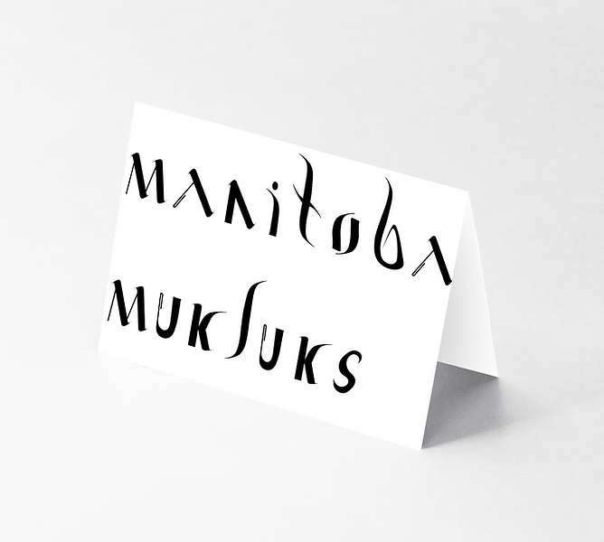
Indigenatively Rooted is a unique typeface that I designed to capture Manitobah Mukluks’ values and voice as an organization, aligning with typefaces that the organization has used to convey their visual identity. Indigenatively Rooted is a combination of the terms “Indigenous”, “innovatively”, “creatively”, and “rooted” to encapsulate the organizations’ objectives to remain rooted in traditional and sustainable Indigenous teachings and practices, while honouring the innovative and creative approaches that Indigenous designers utilize to develop top quality and stylish footwear.
Research
Driven by a profound curiosity regarding Indigenous cultures and practices and positive prior experiences with the organization's footwear, I decided to search for more information about Manitobah Mukluks. By utilizing a character development sheet with a semantic differential scale, I was able to gather the most useful and relevant data possible about the organization to inform the design of my typeface. Exploring different typefaces that Manitobah Mukluks' had used throughout their website, print, and social media materials, also provided me with a better understanding as to how the organization visually represented their brand identity.
Brand research focused on Manitobah Mukluks’ existing visual identity, tone, and public-facing materials.
.png)

A semantic differential scale helped define the intended personality of the typeface, including qualities such as bold, organic, expressive, relaxed, and non-conformist.


Synthesis
Driven by a profound curiosity regarding Indigenous cultures and practices and positive prior experiences with the organization's footwear, I decided to search for more information about Manitobah Mukluks. By utilizing a character development sheet with a semantic differential scale, I was able to gather the most useful and relevant data possible about the organization to inform the design of my typeface. Exploring different typefaces that Manitobah Mukluks' had used throughout their website, print, and social media materials, also provided me with a better understanding as to how the organization visually represented their brand identity.
Constructing a mind map was a crucial step in dissecting Manitobah Mukluks' brand essence, particularly highlighting their dedication to sustainability and cultural heritage preservation. Meanwhile, the mind map was instrumental in pinpointing the brand's distinct and consistent use of bold, sleek, and fluid typographic effects throughout their print and digital materials. The dynamic nature of these typographic elements reflects the traditional handcrafting techniques employed by Canada's First Peoples in creating Mukluks. The organization seeks to capture and honour this craftsmanship, marked by its labor intensity, innovation, and dedication, through their branding efforts.


Ideation
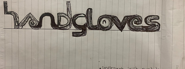
Inspired by my findings from synthesizing, I came up with the idea to reflect this traditional hand-crafted effect in my own typeface design, emphasizing the tactile sensation, heritage craftsmanship, and sustainable methods integral to Mukluk production and the organizations' identity. Keeping in mind the need to embody these core attributes into my developed typeface, I began sketching out the word "handgloves" in as many ways that I could possibly come up with. I did this as a little brainstorming activity, in hopes of finding a central design direction.
Yet, during the sketching phase, I quickly encountered encountered an issue. As I began translating my ideas into physical sketches, dissatisfaction crept in. Although I liked certain aspects of the sketches I made, I still wasn't very fond of any of the stand-alone typefaces at this point in time. I asked myself—how can I possibly assemble the components that I like from each of the sketches together in a cohesive way that reflects the aspects of the organizations' identity that I want to visually convey?
Given my kinesthetic learning preference, I sought a more tactile and interactive way to overcome this creative block. I turned to the world around me, gathering objects that I felt could mimic the fluid stroke effects central to Manitobah Mukluks' visual representation. Sticks, leaves, paint brushes, pencils, and metal tools became my new instruments of creativity. Dipping each item into black paint, I experimented with various stroke effects on pieces of paper. This hands-on approach allowed me to explore a wide range of textures and dynamics that were later incorporated into my typeface design.

Concept Development
With a fresh perspective from completing this activity, I had the confidence and sense of direction needed to start sketching again. This time, I started out by drawing individual letterforms and to maintain consistency within those established letterforms, I drew out the word "hangloves" again.

Prototype
Satisfied with sketches for every letter of the alphabet, I was finally ready to transfer my top letterform sketches into a digital, vectorized typographic format using Adobe Illustrator. Vectorizing letterforms was by far the most challenging obstacle that I had experienced yet throughout the development of this typeface. Never having developed a typeface in Illustrator before and with limited experience using the pen, blob, curvature, and paintbrush tools, I struggled to achieve the smooth outline edges that I was striving to convey visually with my letterforms. Although it was frustrating trying to figure out how to navigate the software initially, after watching various video tutorials and following them in a step-by-step order, I finally reached a point where I was confident using the tools.


User Test
Unfortunately, I didn't get to conduct any user tests with members of the organization, as a way of determining whether they felt that the typeface effectively captured their organizations' spirit, while also aligning with their existing visual brand identity. Despite that, I did get excellent instructor feedback on the project. My instructor felt that the typeface captured the essence of the organization highly effectively, but he did suggest making the edges of the typography smoother in any future iterations.
I'm proud of this typeface and the challenges that I persevered through to develop it, but looking back on it now, there are definitely things that I would do differently today. Specifically, I would have started digitizing the typeface earlier than I had, to give myself enough time to achieve completely smooth edges on all of my designed letterforms and dedicated more time to ensuring a consistent thickness in weight across every single letterform. All in all, this was a great learning opportunity, helping me work more efficiently in future projects, giving myself the necessary time to reach my full potential with my future work.